Coding an ad-hoc UI
I want to talk about the image editor I made for Yarnspin, and more specifically, the ad hoc UI system I made for it.
The image editor will let you preview images and portraits with the selected palette, and make basic adjustments like brightness, contrast, saruration and sharpness, to make it easier to get the look you want for the image in Yarnspin.
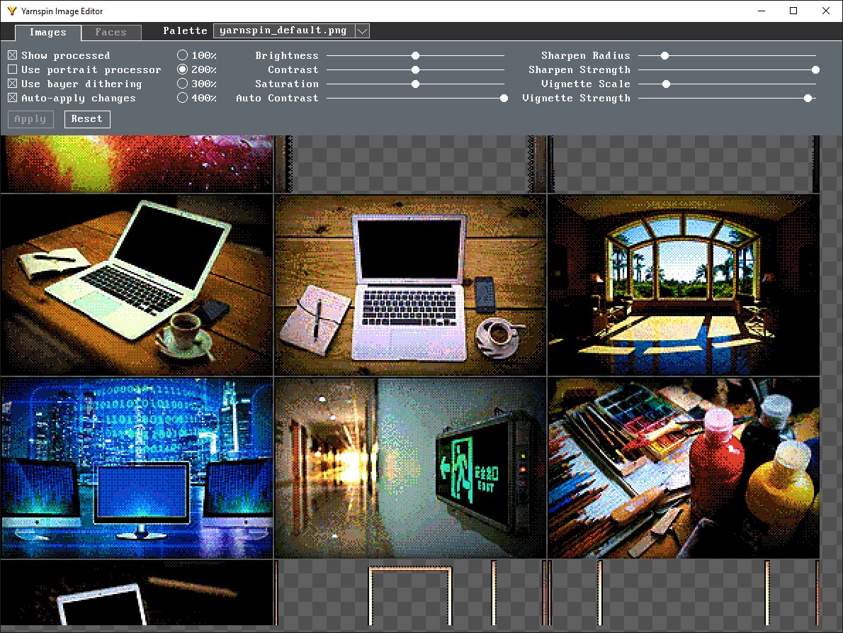
There are a lot of solutions available for making GUI apps. And there are some really good UI systems, and I could well have used one of them to good effect. But the thing is, I rarely enjoy programming in systems like that, and my hobby projects are primarily for my enjoyment.
And given how little UI this tool needed, it just would feel like overkill to pull in a large library for this. I’ve made custom UIs before, so feel pretty comfortable with it, but I know it can feel a bit daunting when unfamiliar, so I want to share how mine ended up looking.
Maybe I should put a disclaimer in :) I am not saying you *should* do your ui like this, I’m just saying you *could*. Or more appropriately, that I happened to do so during a weekend coding frenzy, and it worked out nicely enough.
I am going to show a lot of code here. It is not particularly good code. It is sloppily written, with copy-pasted bits and magic numbers everywhere. That’s ok, a lot of code that I write looks like that in the first pass. Sometimes I even refactor it later. And I think that we should share our bad code too.
So, the panel at the top of the app is all of the UI. Tabs, dropdown menu, checkboxes, radio buttons, sliders, and buttons. It is a quite comfortable list of element types, but as we'll see, it is enough for there to be some interesting things to implement.

I made this in immediate mode style. Here you can see the code for adding all the UI elements to the panel. Don’t worry about the details, just want to show you the scale:
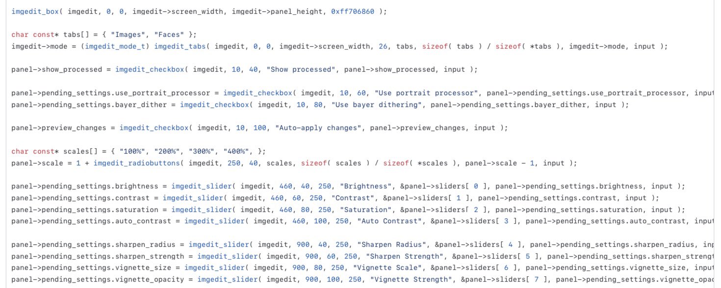
The nice thing about an immediate mode ui, is that it doesn’t need a lot of state. You don’t need to create or register elements, you just call a function on each frame update to draw the element and run its logic. Many UI components don’t need any state, but some do as we’ll see.
Let’s have a look at the checkbox first. It is invoked like this. 
I pass it the imgedit context, just because it conveniently holds the screen for drawing, but I could just as well just have passed a screen pointer and width/height. Then comes the x/y position on the screen, the checkbox label, a bool indicating it’s current value, and user inputs for this update.
Here is the implementation of the checkbox component. There’s not a lot. I basically just check if the mouse cursor is within its bounds. If there is also a click, I toggle the state. Then just draw the text label and a box, and if it is checked, two lines to make an X.
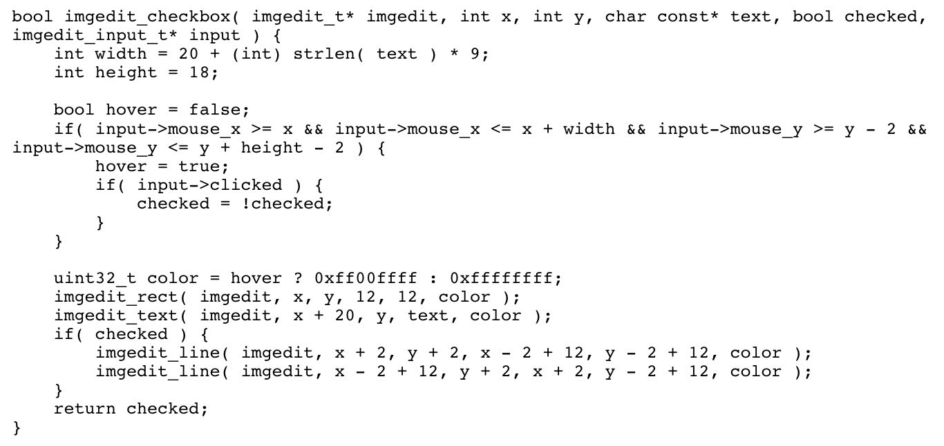
I think it’s worth noting how simple, brief, and localized this code is. The whole behavior of the checkbox is all here, and easy to change. Personally, this is the kind of code I find very enjoyable to work with. Low threshold for modifying and experimenting, and very direct.
For the radio buttons, only one of them (within a group) can be activated at a time. Since I didn’t need much control over their placement, I decided to just pass an array of text label strings, and the currently selected index. The code is not much more complicated than that for the checkbox.
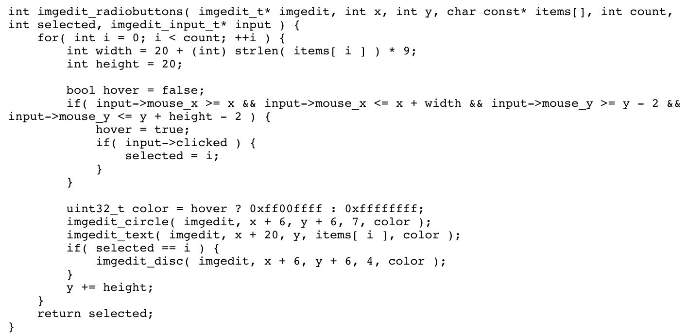
Tabs are really just radio buttons rendered differently :) With an immmediate mode gui model, we can decide what to show with just an if-statement, so just knowing which tab index we are on allows us to draw different panels.
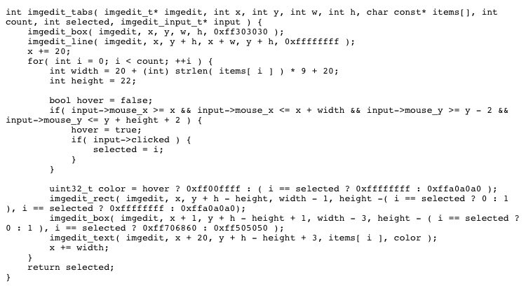
Note how I shamelessly duplicate some of the code here :) That's fine. I think duplication of manageable code sections is a good and useful tool, For me, splitting every single common thing out into separate micro-functions makes the code much harder to work with.
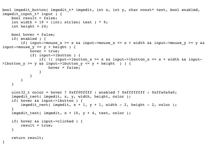
A standard button should really work like this: when you press and hold, it is rendered as pressed. When you let go, it triggers. If you move away and let go, it does not. Letting the input struct hold the x/y coordinate of the initial press, lets us do this without needing state for each button.
For sliders, I need some state though. I need to know that it is activated, what the start value was and the initial click position, so I can update the value as the user moves the mouse. That makes sliders a bit more complex.
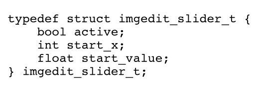
I guess there’s many ways I could have done this, but I opted to just hold a separate state instance for each slider, and just pass one instance to each slider.
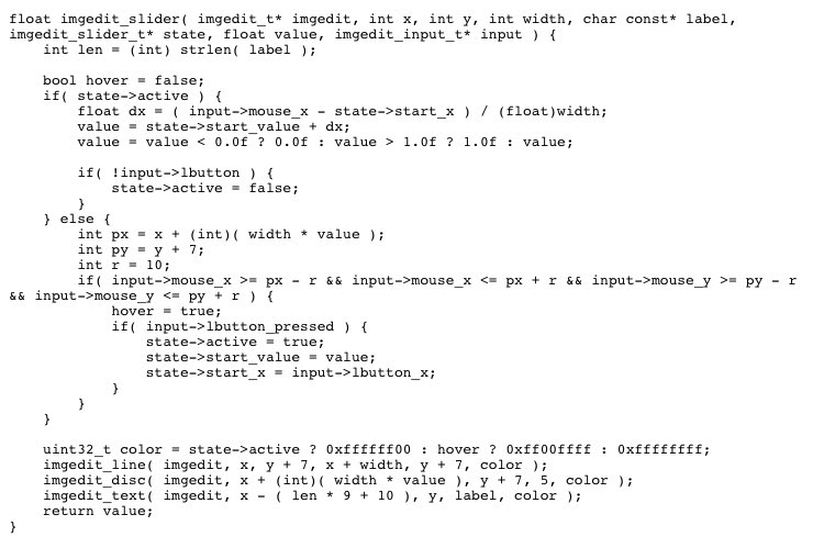
If this was intended as a full, reuseable ui system, that bit should really be done automatically, instead of manually allocating a state instance.


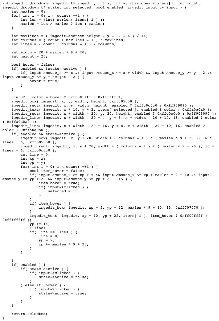
As a last bit of code, I’ll show you the dropdown menu as well. Obviously, more complex controls will take more code to implement, but it still feels rather manageable - it’s just more of the same really. And still the kind of code I find enjoyable to work with:
So there’s my quick tour of my improvised ui system. I’m not suggesting you should do this instead of using a proven one. But, if you are making a small thing with modest UI needs, you might find it enjoyable to give it a go :) And what I really wanted to do, was show that writing your own UI system does not have to be very complicated, and it doesn't have to be a lot of code.
The full code can be found on github.
Yarnspin Discord Server
If you enjoyed this writeup, why not join the freshly started Yarnspin discord server, and come chat about everything related to interactive fiction, text adventures and visual novels, and the implementation of them.
https://discord.gg/ZVuX2pwS24
Get Yarnspin
Yarnspin
The Story Telling Engine
| Status | Released |
| Category | Tool |
| Author | Mattias Gustavsson |
| Languages | English |
More posts
- Yarnspin 2.0 ReleasedFeb 20, 2024
- Designing the Yarnspin EngineJun 10, 2023
- Yarnspin Code ComponentsJun 09, 2023
- The Inspiration for YarnspinJun 08, 2023
- Yarnspin Discord ServerJun 05, 2023
- Yarnspin v2.0 Dev UpdateApr 27, 2023
Leave a comment
Log in with itch.io to leave a comment.