Making my own music player
A couple of years ago, in September 2021, I was getting ready to release my own MP3 music player "I ♡ Music", and I did a little writeup about it, and I thought I'd share it here now :)
I started working on it a few years ago, and have tinkered with it on and off, and using it as my main music player all that time. I decided to make it because I couldn't find one that was just the way I wanted it. And now that it is fairly complete, it makes sense to share it.
I wanted an offline, local app MP3 player for Windows. One that was really fast and responsive, and could handle large number of songs/albums without slowing down. My personal music collection is around 1000 albums/16 000 songs/100GB, so it must definitely be able to handle that.
Also, I listen almost exclusively to albums. Not single tracks or playlists. So I wanted a player that put albums first, that makes it easy to browse albums and listen to a whole album in one go. Some players are very playlist focused, and I didn't want that.
Another thing is I really like the artwork on album covers, sleeves and leaflets. I wanted a player that is very visual, that puts the artwork front and center, and allows me to flip through leaflets when available. Something which feels a bit like a real world album collection.
The last clear requirement I had from the start, was that I didn't want it to feel "busy". There shouldn't be too much going on in the player window. Rather go a bit minimalist. I feel like some players have too much information and animations, and that's just a bit stressful.
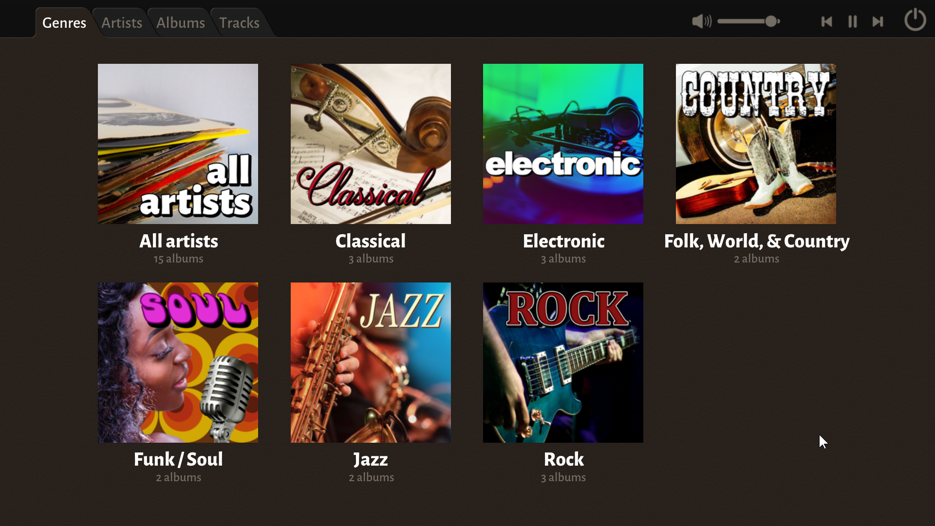
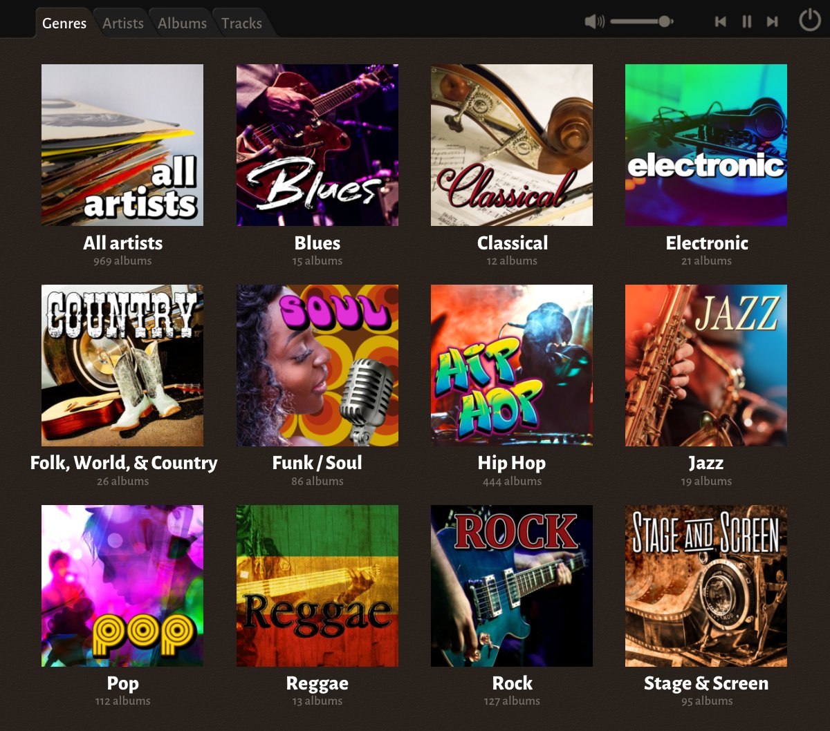
The player looks like this when you launch it. This is after it has scanned my music collection. The scanning does take some time, but is only done once, and it happens in the background. And it populates the views as it goes along, so you can use the app meanwhile.
I wanted a division into different categories, but the category field in MP3 ID3 tags is quite a mess. There's no good standard set of categories. So I decided that for my own collection, I decided to go with the ones defined on discogs.
My player doesn't put any restrictions on genres though, but it only comes with pre-defined genre thumbnails for the ones from discogs. But it is easy to add custom ones. I made mine (shipped as the default ones) using pictures I downloaded from pixabay.com.
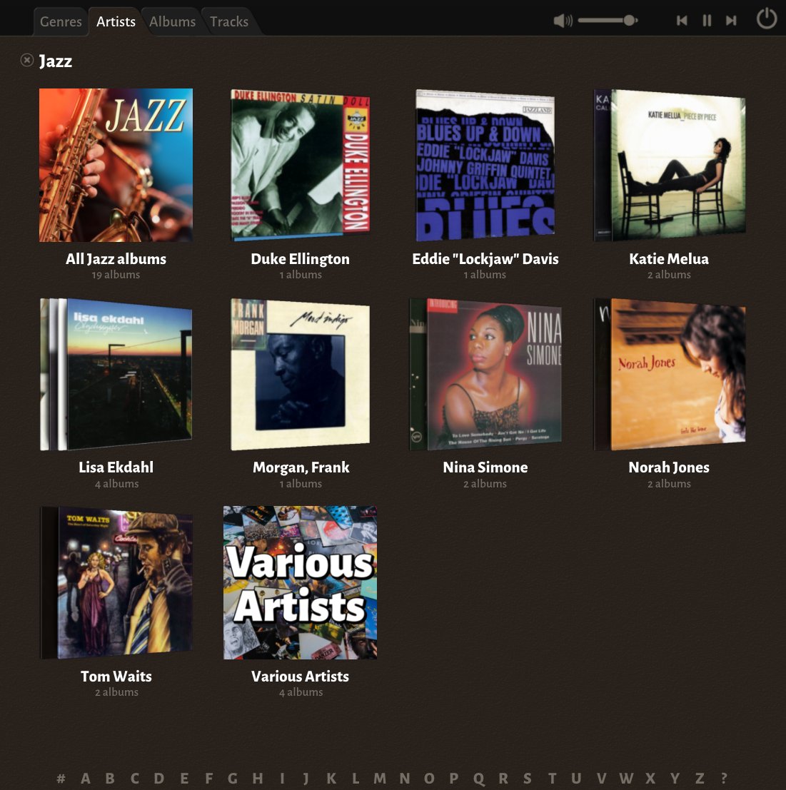
Selecting a genre gives you a view like this. The idea is that the tabs at the top let you choose different views, and selections apply a filter, such as the "Jazz" filter applied here - the X next to "Jazz" would clear that filter and instead show all artists.
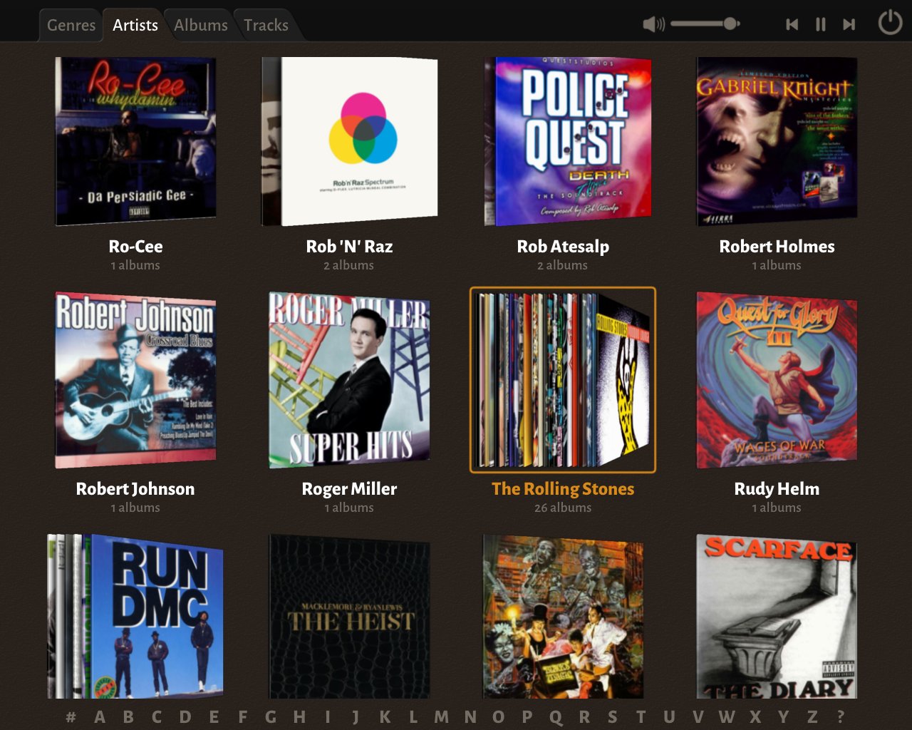
It was clear from the start that I wanted the hierarchy Genres-Artists-Albums. For thumbnails for artists, I had the idea to generate a stack of all the albums by the artist, and I think it works really well. Even for artists where I have a lot of albums, like The Rolling Stones.
For artists with only a single album, it doesn't make as much sense, but I decided to still use the tilted image to make the Artists view different from the Albums view.
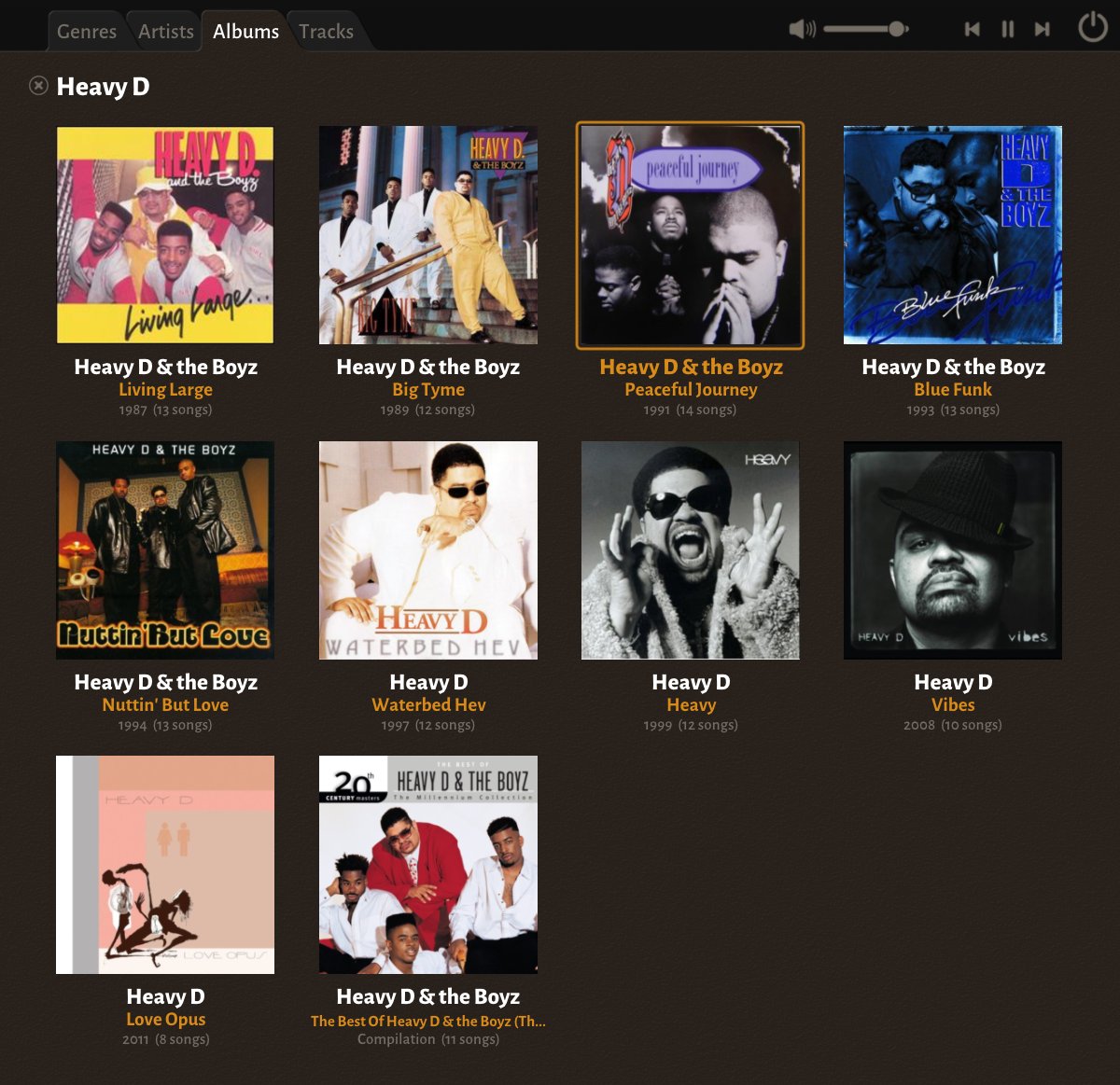
Selecting a specific artist, will show all the albums for that artist, ordered by year, but with compilation albums at the end. I use the Sort Artist field of the ID3 tags to allow grouping albums by the same artist released under different names: Heavy D vs Heavy D & the Boyz.
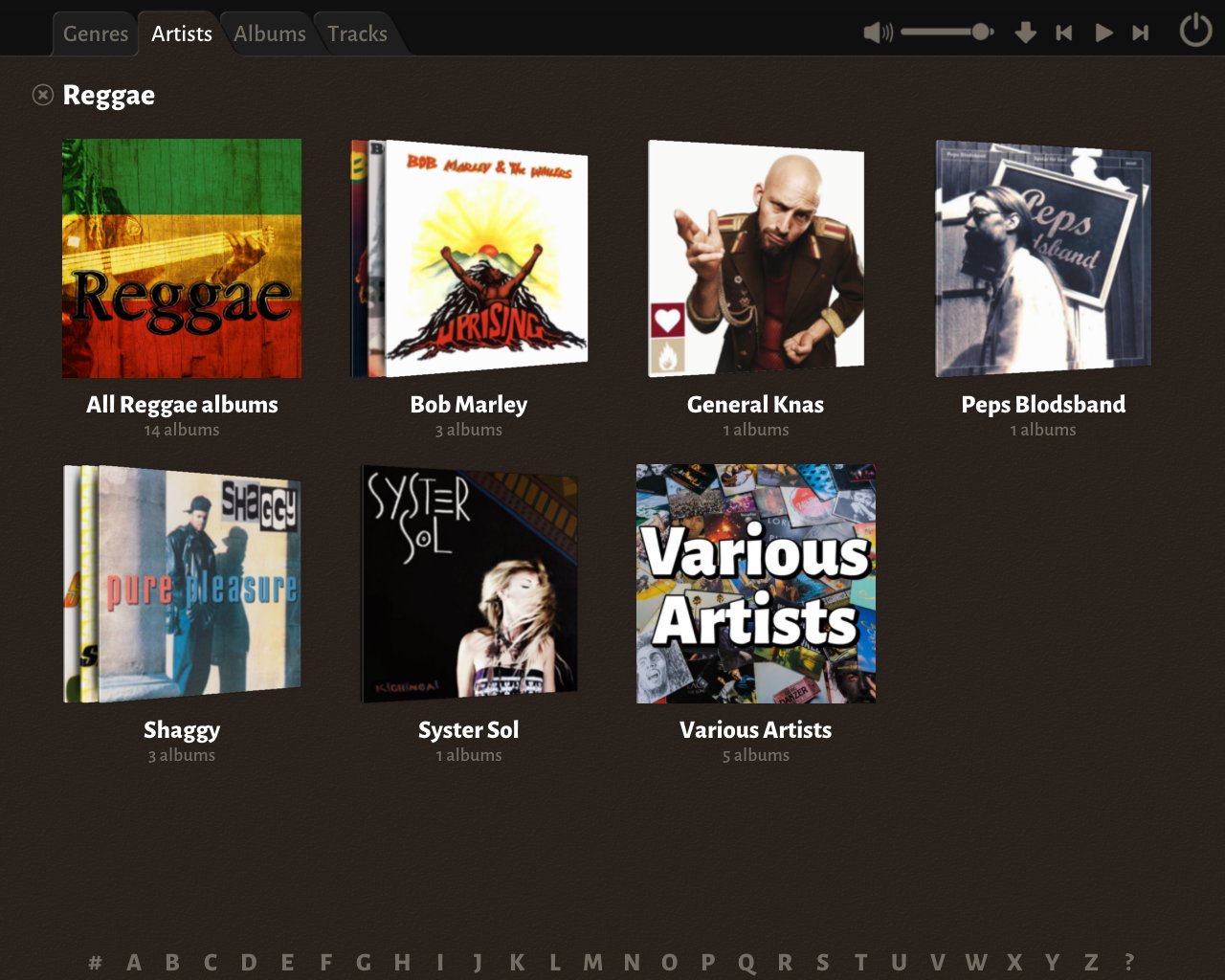
I make a special case out of albums by Various Artists. Instead of the stack of albums there is a dedicated one, as this slot can grow very large very quickly. It will include both albums which specifically have "Various Artists" as Album Artist, or detected automatically.
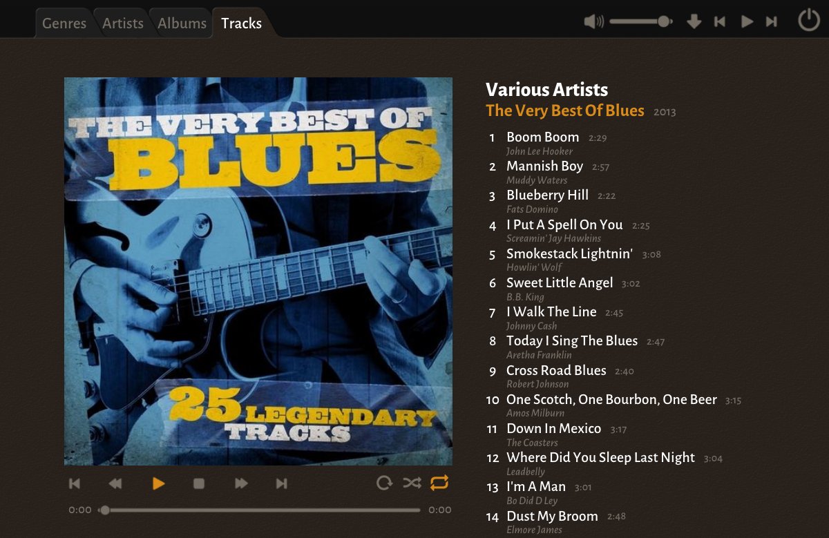
When you select an album, the view you get looks like this. The album cover is given a lot of space. As this particular album has songs by different artists, the artist name for each track is displayed underneath the track name.
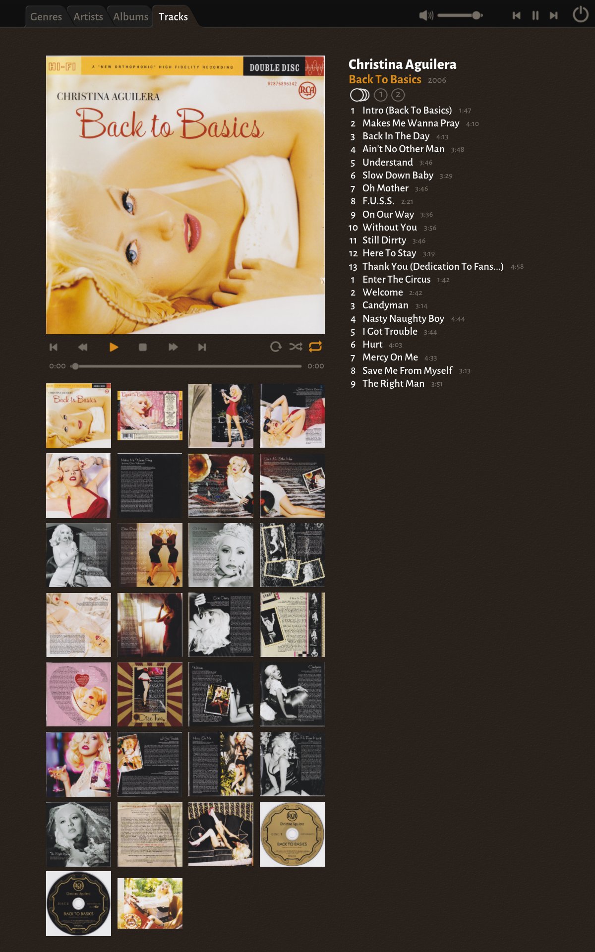
If an album has multiple discs you can select all discs or individual discs. If a track has a "featuring" or "with" or similar attribution, it is again displayed next to each track name.
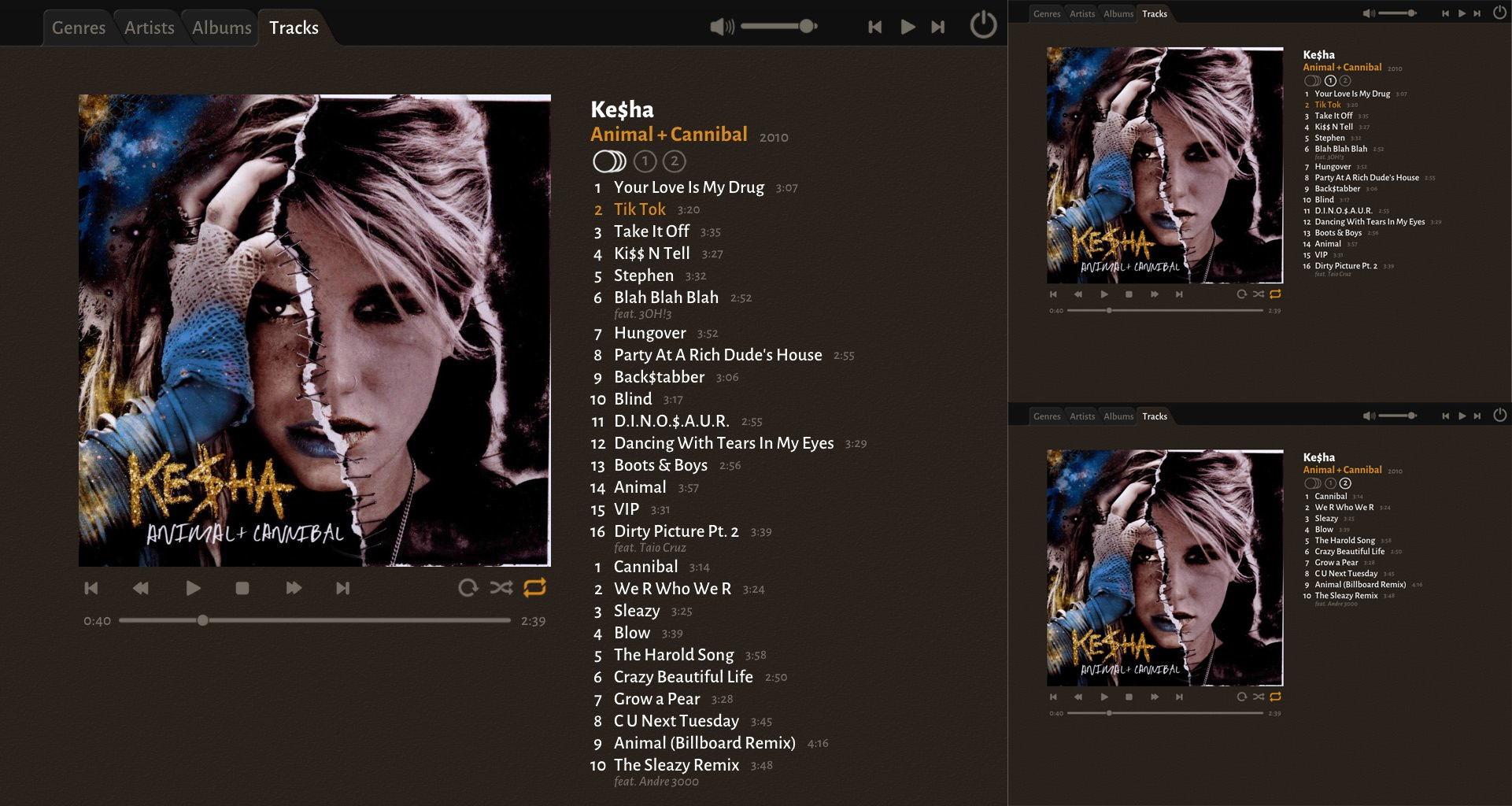
As it is possible to add lots of images to the ID3 tag data for an album, I sometimes take the time to do that. If there are additional images, they are displayed as thumbnails, and you can click them to display them larger.
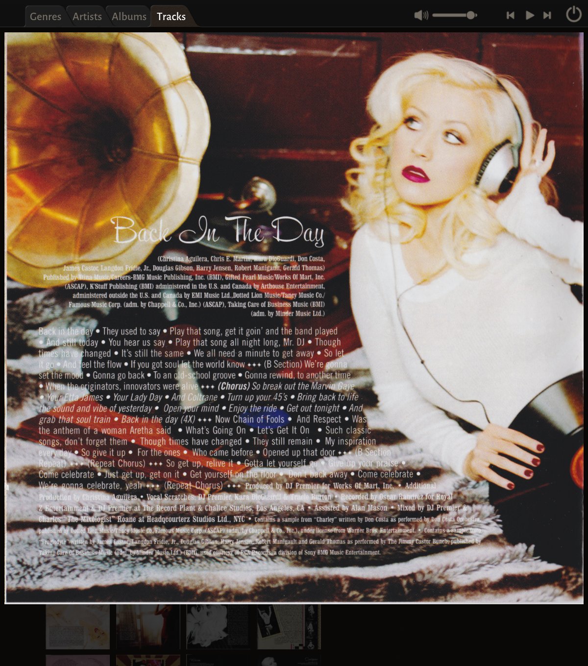
You can even zoom in on images, and have them fill the entire screen - useful to read album notes or lyrics.
So there, that's a quick tour of I ♡ Music. I realize that the need for MP3 players are not very high these days, given the huge amount of music offered by streaming services. But since I built this anyway, it didn't feel right not to share it.
Get I ♡ Music
I ♡ Music
MP3 Player/Organizer
| Status | Released |
| Category | Tool |
| Author | Mattias Gustavsson |
Comments
Log in with itch.io to leave a comment.
That makes me nostalgic about the days I used to have tons of music offline, categorized like that...
It is admittedly a relic these days with the streaming services on offer. But I still really like it!
Oh don't get me wrong, I like it too! It's just that I don't have the time to maintain my collection nowadays... But I'll be trying the player, definitely.
I figured most people don’t have a bunch of MP3 files anymore, which is why I bundled a small collection of free music with the player, make it easier for those who just want to try it out :)
Haha that's a great idea! I do still have my collection on my NAS, so I'm going to try it with that.
You should incorporate a visualizer with the crt filters (amazing job there, btw) 😁